Expert Allies
Expert Allies is a software development consultancy helping companies scale engineering teams and deliver digital products. I led the experience from strategy through visual design, creating a brand identity and responsive marketing website that translated complex technical services into a clear, conversion-focused experience. The work covered logo, colour system, brand guidelines and a multi-page website.

The challenge
Expert Allies is a software development consultancy helping companies scale engineering teams and deliver digital products.
The objective was to create a trustworthy brand identity and a modern marketing website that could communicate complex technical services clearly while building confidence with potential clients.
The challenge wasn’t simply to create a more modern website. It was to translate a complex range of services into an experience that helped decision-makers quickly understand what Expert Allies offered, why it was relevant to them and what the next step should be.
I led the experience from strategy through visual design, creating a consistent brand and responsive website that supported both marketing and business goals.
Research and visual direction
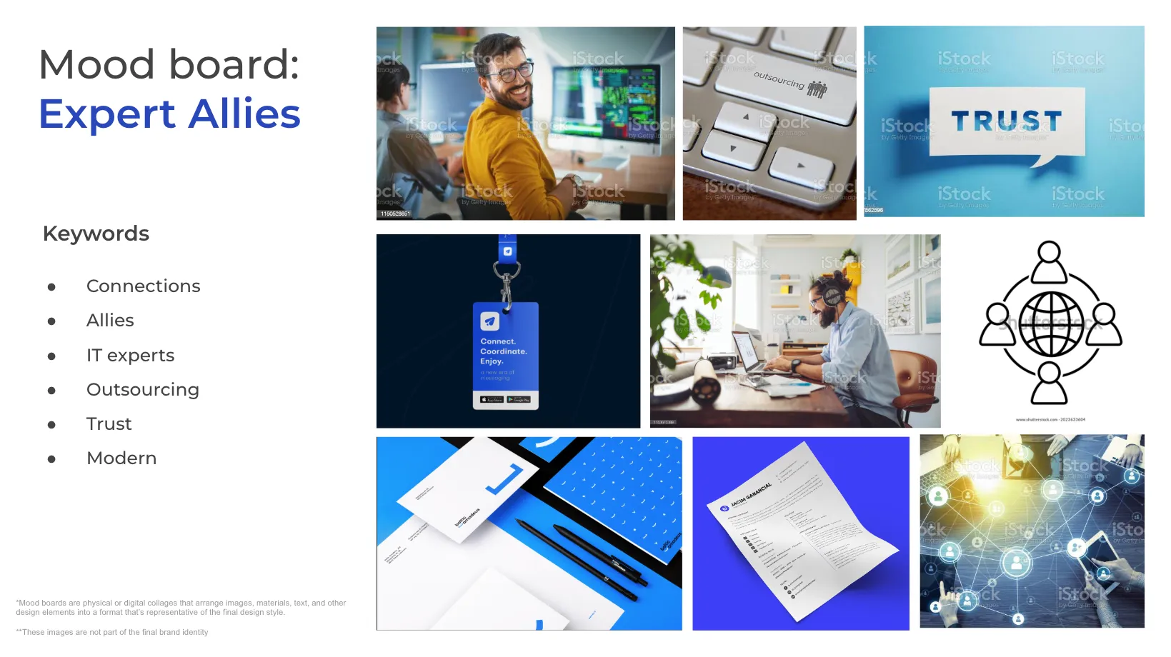
The visual direction emerged from competitor analysis, brand exploration and moodboards built around three positioning qualities: professionalism, trust and approachability.
Most software development agencies default to a corporate, feature-heavy presentation. The opportunity was to communicate technical depth with a more accessible personality, creating a brand that could feel credible to enterprise decision-makers without becoming intimidating or overly corporate.
These positioning goals became the foundation for the brand identity, information architecture and visual direction.
Creating the brand identity
The visual identity was designed to communicate reliability, expertise and forward momentum: qualities decision-makers look for when choosing a technology partner.
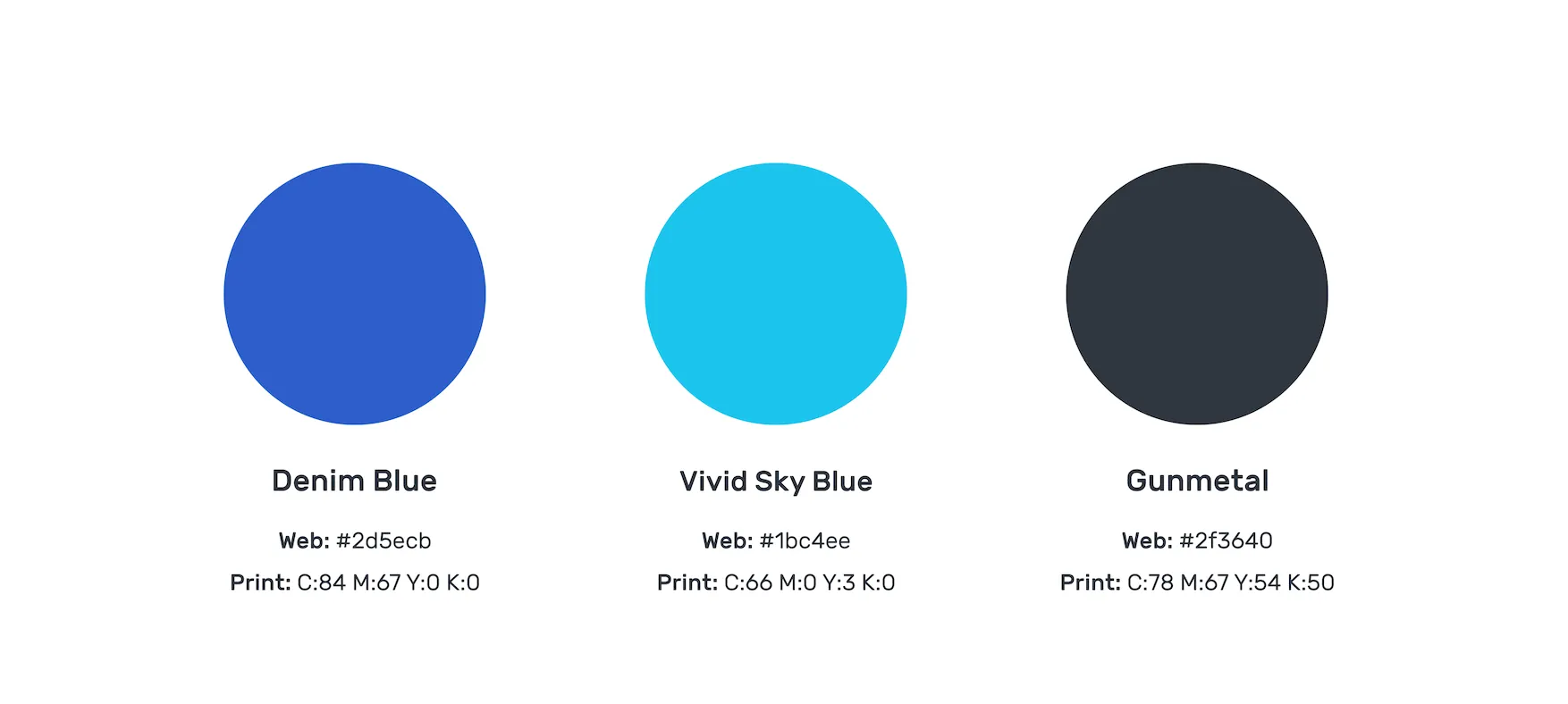
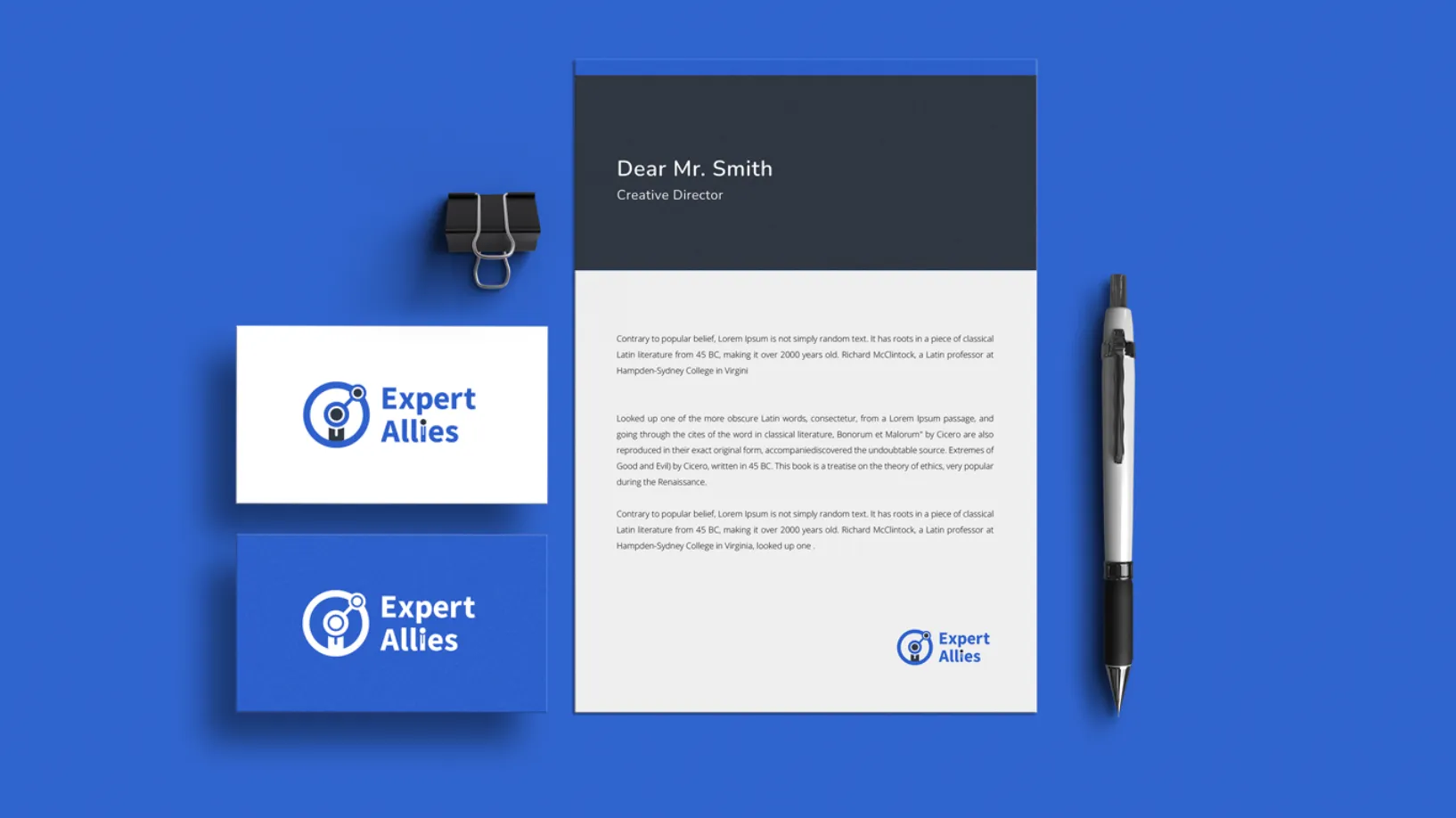
The logo pairs a connection network motif with a professional figure, communicating both the consultancy model and the human element of technology delivery. The colour palette combines a deep denim blue for authority and a vivid teal accent for energy, creating differentiation within a competitive category without sacrificing credibility.
The brand system covered logo, colour palette, typography, marketing assets and brand guidelines, ensuring a consistent experience across digital and print.

Today I would bring AI into the research and brand exploration phases from day one, using it to synthesise competitor positioning, generate visual direction hypotheses and stress-test brand language before a single pixel is drawn.
Designing a conversion-focused website
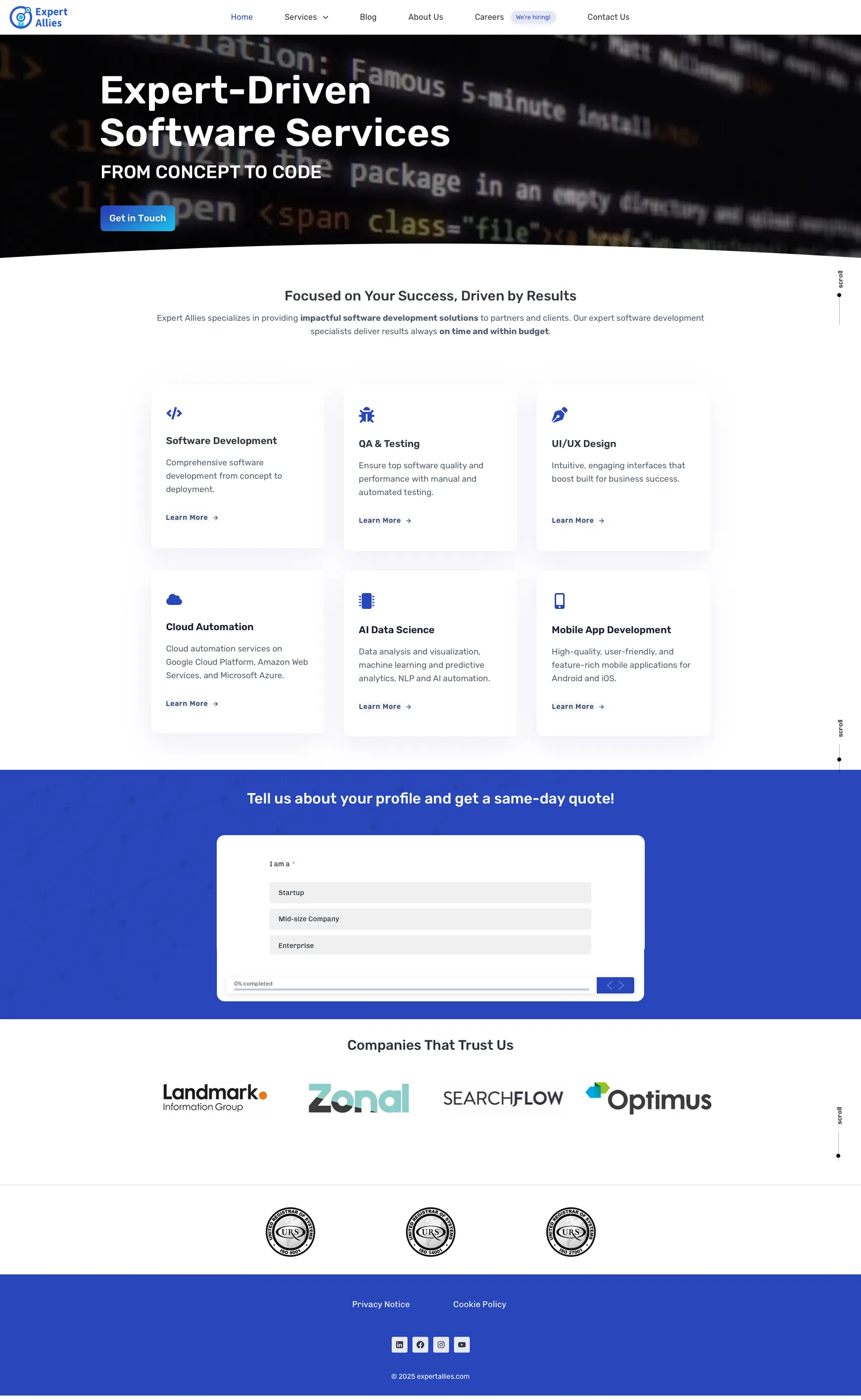
The website was designed around a simple business goal: help potential clients understand the value of Expert Allies and make it easy to take the next step.
The experience was structured around clear information hierarchy, confident calls to action and trust signals positioned at key decision points.
Services were broken down into discrete, scannable sections so visitors could quickly identify relevant offerings without having to understand the full complexity of the consultancy’s capabilities.
Supporting the customer journey
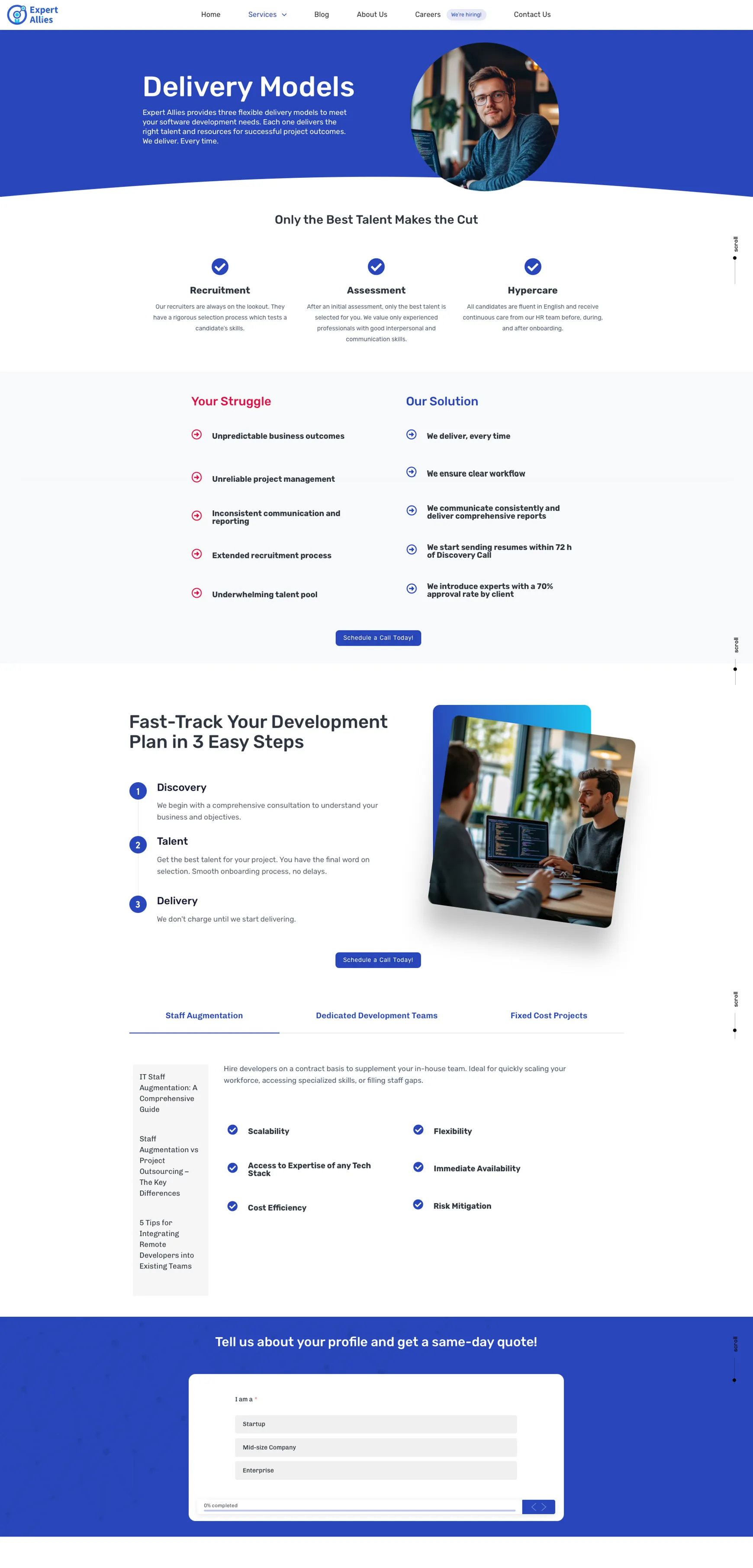
Beyond the homepage, dedicated pages explained delivery models, service offerings and engagement processes in structured, digestible formats.
Rather than presenting everything at once, the content was organised around the questions a prospective client would naturally have during evaluation: what does Expert Allies offer, how does the engagement work, what is included and what happens next?
This information architecture became one of the most important parts of the experience, helping turn a complex range of technical services into a clearer customer journey.
Responsive experience
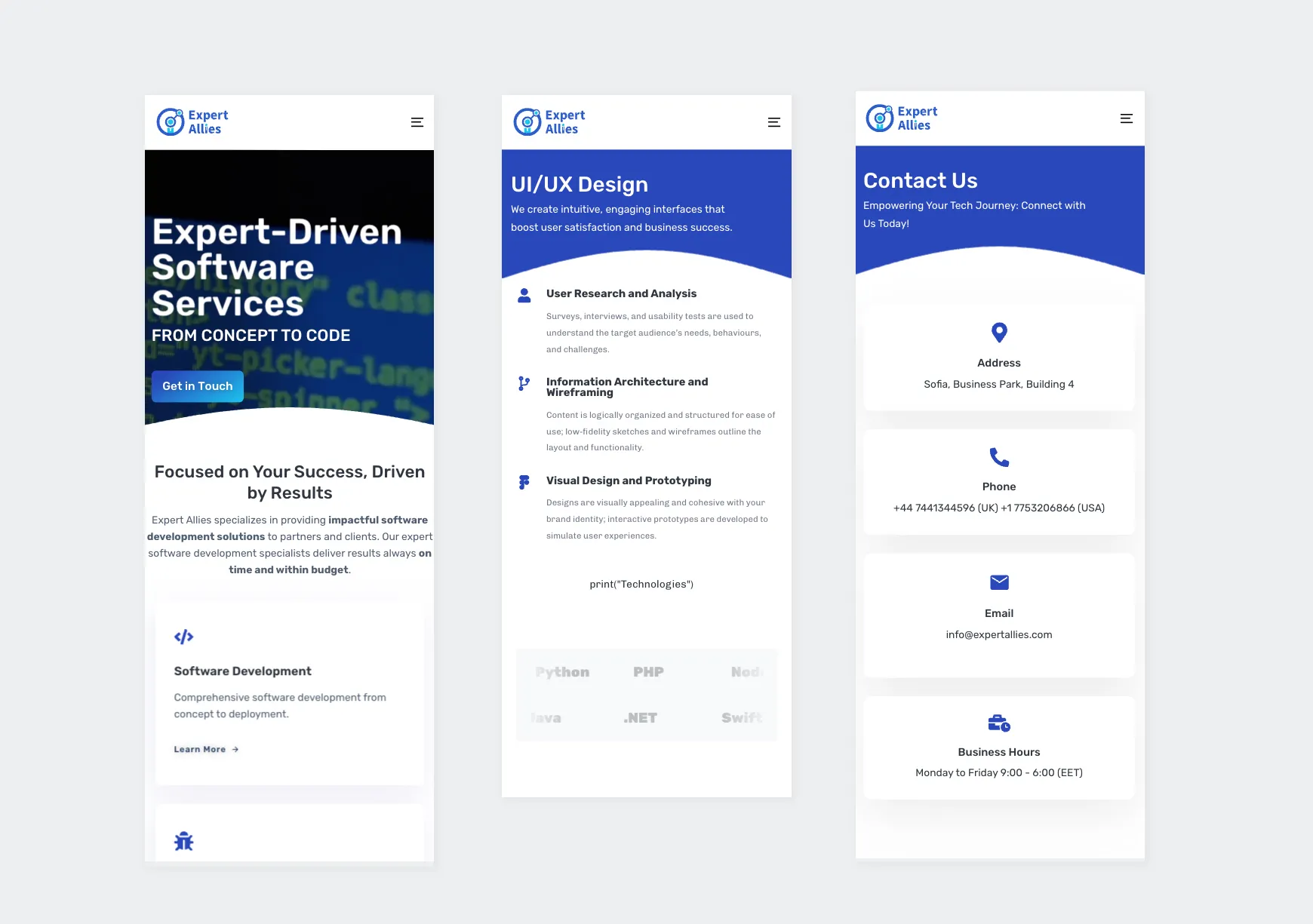
The experience was designed mobile-first, ensuring users could browse services, understand offerings and contact the company from any device.
Layouts, spacing and navigation patterns were adapted across breakpoints to maintain reading comfort and interaction clarity, whether a visitor arrived on a desktop during research or on mobile after a referral.
Outcome
The result was a clearer digital presence that brought the brand, service offering and customer journey together into one consistent experience.
The new structure made the consultancy’s capabilities easier to scan and understand while creating clearer paths towards engagement.
Reflection
Expert Allies reinforced the importance of connecting design decisions to a real business problem rather than treating visual design as the end goal.
The most valuable work was not the logo or colour palette. It was the information architecture and content strategy that determined how the services were presented and how visitors moved through the experience.
That clarity required the most iteration and had the greatest potential impact on the overall customer journey.
If I were approaching the project today, AI would accelerate the early stages significantly: synthesising competitor research, exploring positioning hypotheses, generating and testing content structures, and producing accessible copy variations.
I would then use AI-assisted prototyping and design-to-code workflows to shorten the distance between the validated design and the final website.