Dentobook
Dental clinics rely on fragmented tools and manual processes. I owned the end-to-end product experience for Dentobook, a practice management platform built to unify scheduling, patient records, treatment planning and billing into a single system. The work covered brand identity, design system and complex clinical workflows across all clinic roles: receptionists, dentists and administrators.
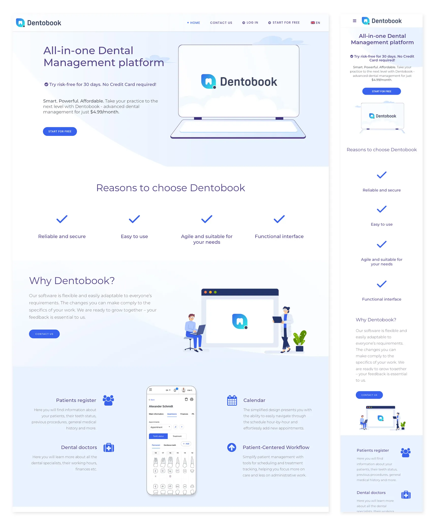
Dental clinics often rely on fragmented tools and manual processes. I owned the end-to-end product experience for Dentobook, a practice management platform built to bring scheduling, patient records, treatment planning and billing into a single system.
The work spanned product strategy, UX, brand identity and design systems, with complex workflows designed around the needs of receptionists, dentists and administrators.
The opportunity
Dental clinics often rely on disconnected systems and manual processes. Scheduling appointments, managing treatments and accessing patient records can become unnecessarily complex, especially when different roles need to work with the same information in very different ways.
The opportunity was to create a unified platform that simplified these everyday operations while remaining flexible enough to support the different needs of receptionists, dentists and administrators.
I owned the product experience from discovery through implementation, working closely with stakeholders and developers to translate complex clinical workflows into a scalable digital product.
Understanding the problem
The project began with stakeholder workshops, competitor analysis and research into existing clinic workflows.
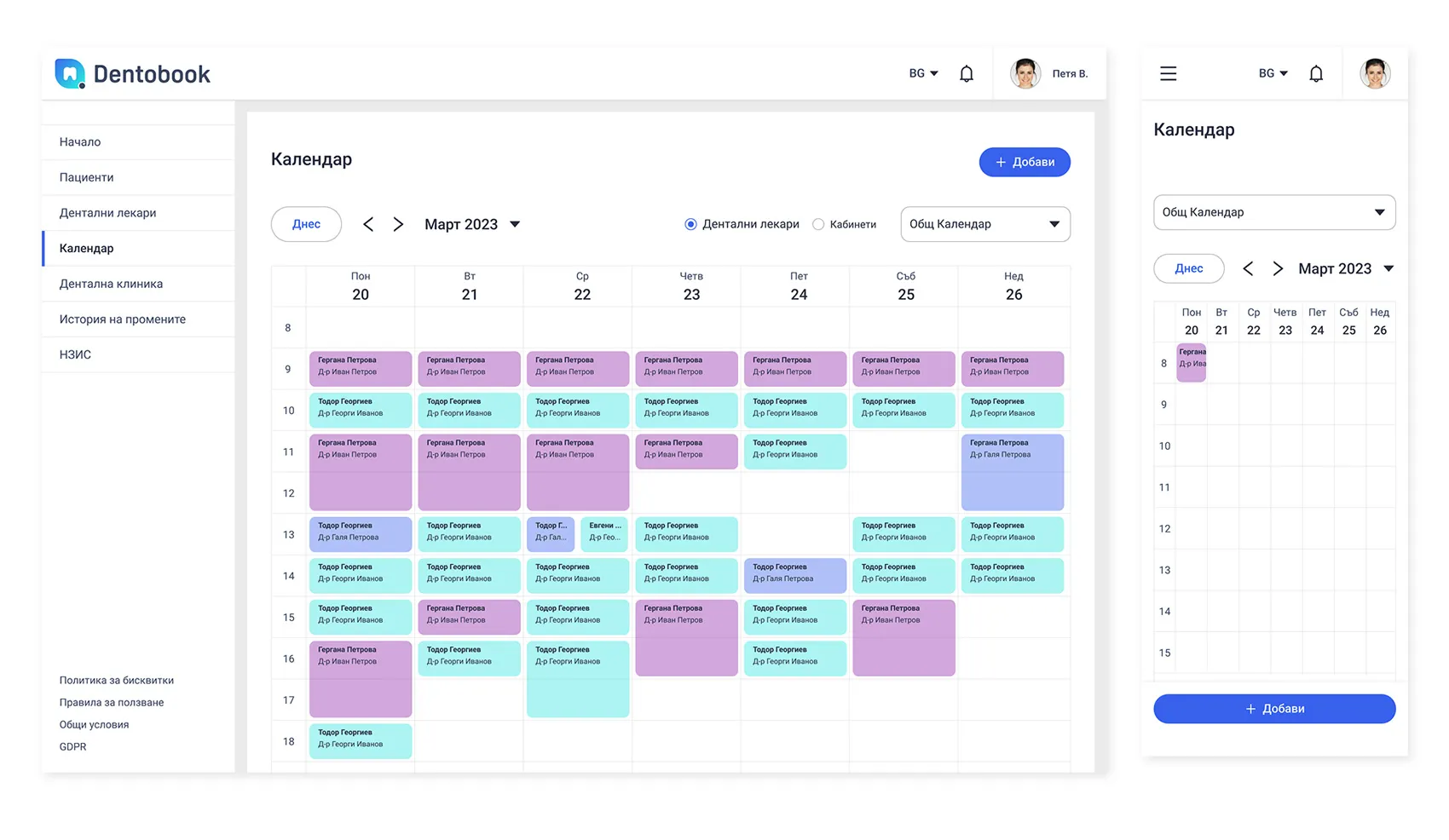
Looking at the experience across different roles highlighted an important challenge: the same patient and appointment information needed to support very different tasks. Receptionists needed speed and visibility, dentists needed depth and precision, while administrators needed broader control and oversight.
These insights shaped the product strategy, information architecture and interaction patterns, while also influencing the direction of the visual identity.
Creating a trusted brand
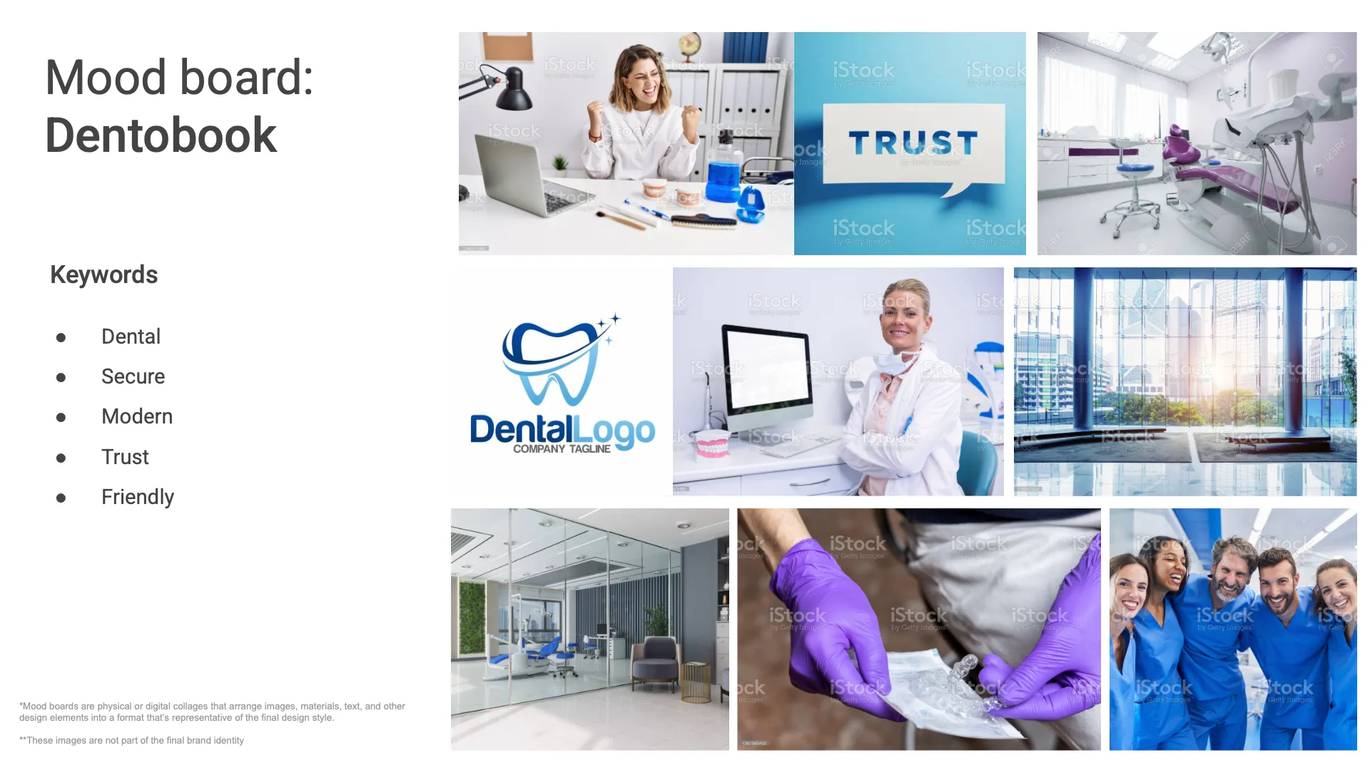
The visual identity was designed to feel modern, approachable and reliable while maintaining the professionalism expected from healthcare software.
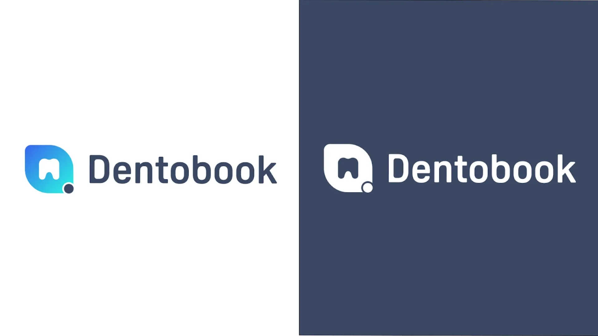
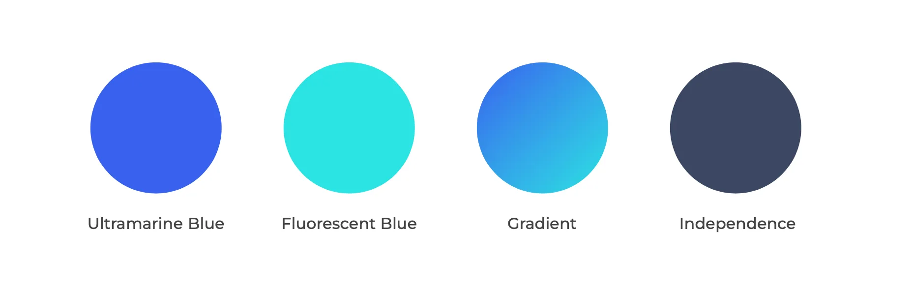
The logo combines a tooth form with a booking/notification motif, communicating the core product proposition at a glance. The colour palette pairs a high-saturation primary blue with a fluorescent teal accent, creating energy and differentiation without sacrificing clinical credibility.
The branding system covered logo, colour palette, typography and accessibility guidelines, ensuring consistency across both marketing and product surfaces.
Building a scalable design system
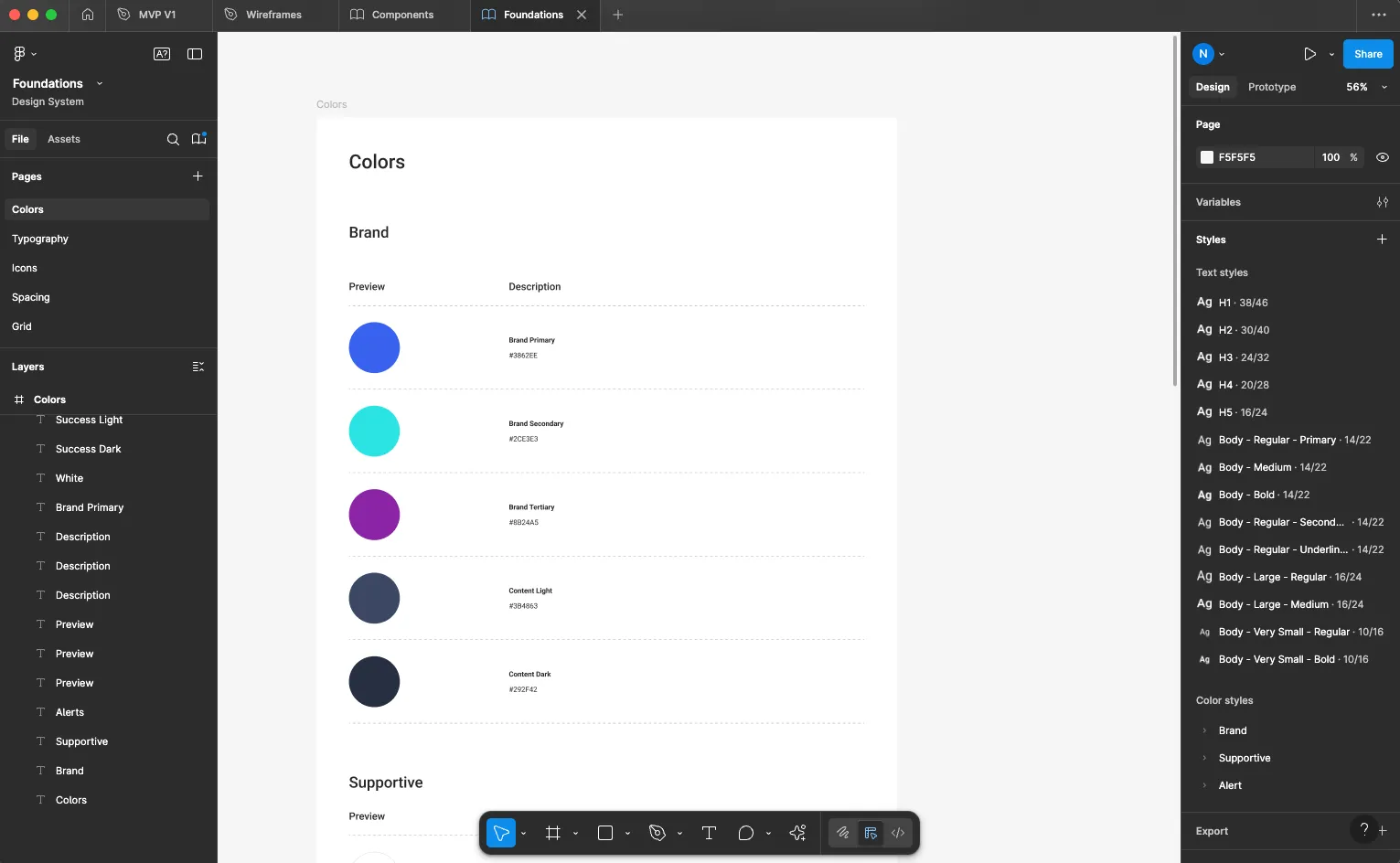
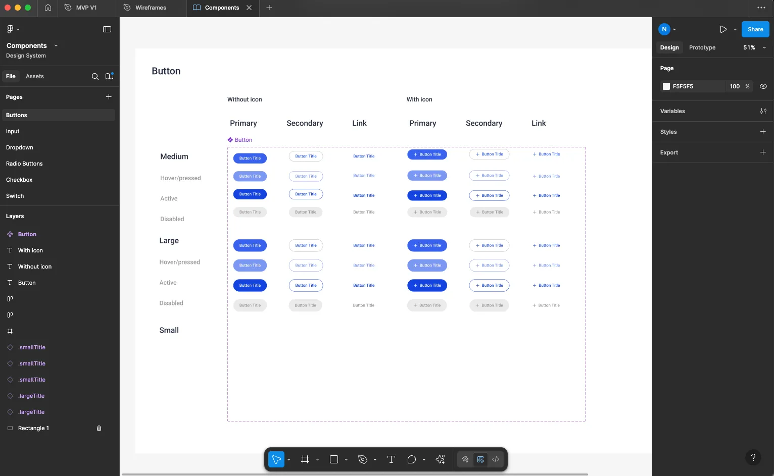
To ensure consistency across the platform, I built a reusable design system covering foundations, typography, colours, spacing, icons and modular UI components, connected directly to Figma variables for a single source of truth.
The system reduced inconsistencies across screens, accelerated design decisions during sprints and gave the engineering team a stable, well-documented component library to build from.
The system was designed not only for consistency, but to provide a scalable foundation as the product evolved. Foundations, components and interaction patterns were structured as reusable building blocks, giving design and engineering a shared language for extending the platform.
Today I’d further accelerate this using AI-assisted component generation, design validation and design-to-code workflows, compressing the time from design decision to production-ready component.
Designing complex workflows
The product was designed around the real daily rhythms of a dental clinic rather than an idealised workflow.
I mapped the key journeys across different roles and designed the experience around the moments where people need to make decisions, access information or hand work over to someone else.
This helped establish a consistent interaction model across the platform while allowing each workflow to reflect the specific needs of the role using it.
Key experiences designed across the platform:
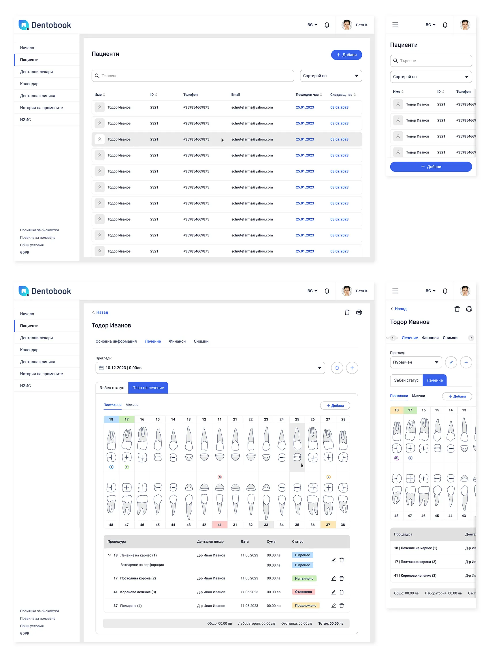
- Appointment scheduling and calendar management
- Patient registration and medical history
- Treatment planning and dental charting
- Financial records and billing
- Clinic administration and multi-practitioner views
- Responsive experiences across desktop and mobile
The interface prioritised clarity and efficiency, helping users complete common tasks with minimal friction, whether they were at a desk or moving between treatment rooms.
Accessibility by design
Accessibility was embedded throughout the design process rather than validated as a final step.
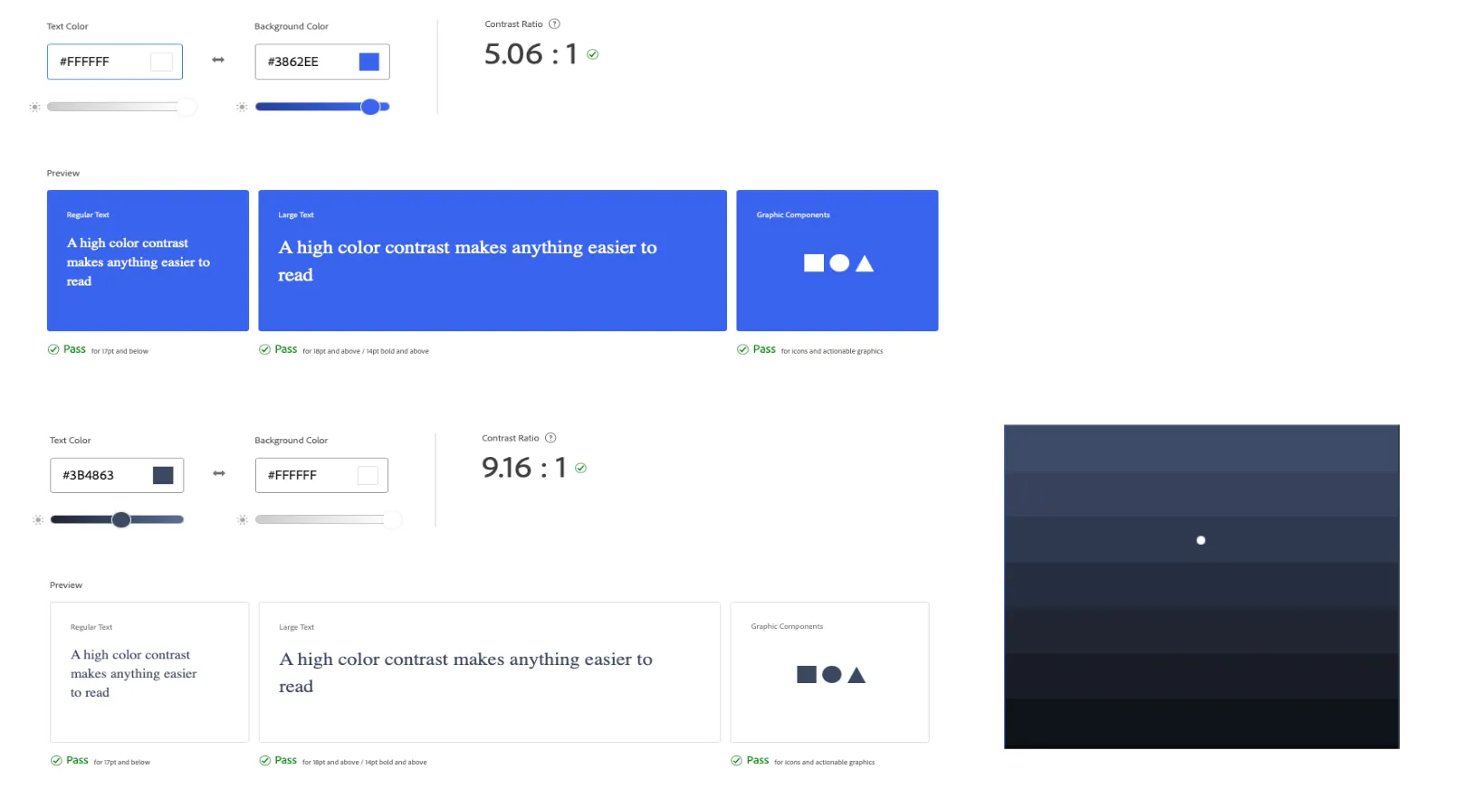
Colour combinations were tested against WCAG contrast requirements at every stage. The primary brand blue (#3862EE on white) meets AA for all text sizes at 5.06:1. Dark content on white achieves 9.16:1, comfortably exceeding AAA. Typography, interactive states and component focus behaviour were all designed with assistive technology in mind.
Outcome
The result was a unified practice-management experience spanning appointments, patients, treatment planning and billing, supported by a reusable design system and a consistent interaction model.
The work established a scalable foundation for expanding the product while keeping the experience coherent across different clinic roles.
Reflection
Dentobook strengthened my experience designing complex B2B SaaS products, from product strategy and information architecture through to design systems and implementation collaboration.
The most challenging part was balancing the competing needs of different user roles within a single product. Receptionists need speed and clarity, dentists need depth and precision, while administrators need control and oversight. Getting that balance right required continuous stakeholder input and iterative validation rather than a single upfront design pass.
If I were approaching the project today, AI would be part of the process from day one: accelerating research synthesis, exploring alternative solutions, stress-testing workflows and closing the gap between design and production through AI-assisted prototyping and design-to-code workflows. The core principles remain unchanged: understand the real problem, design scalable systems and build closely with engineering.